

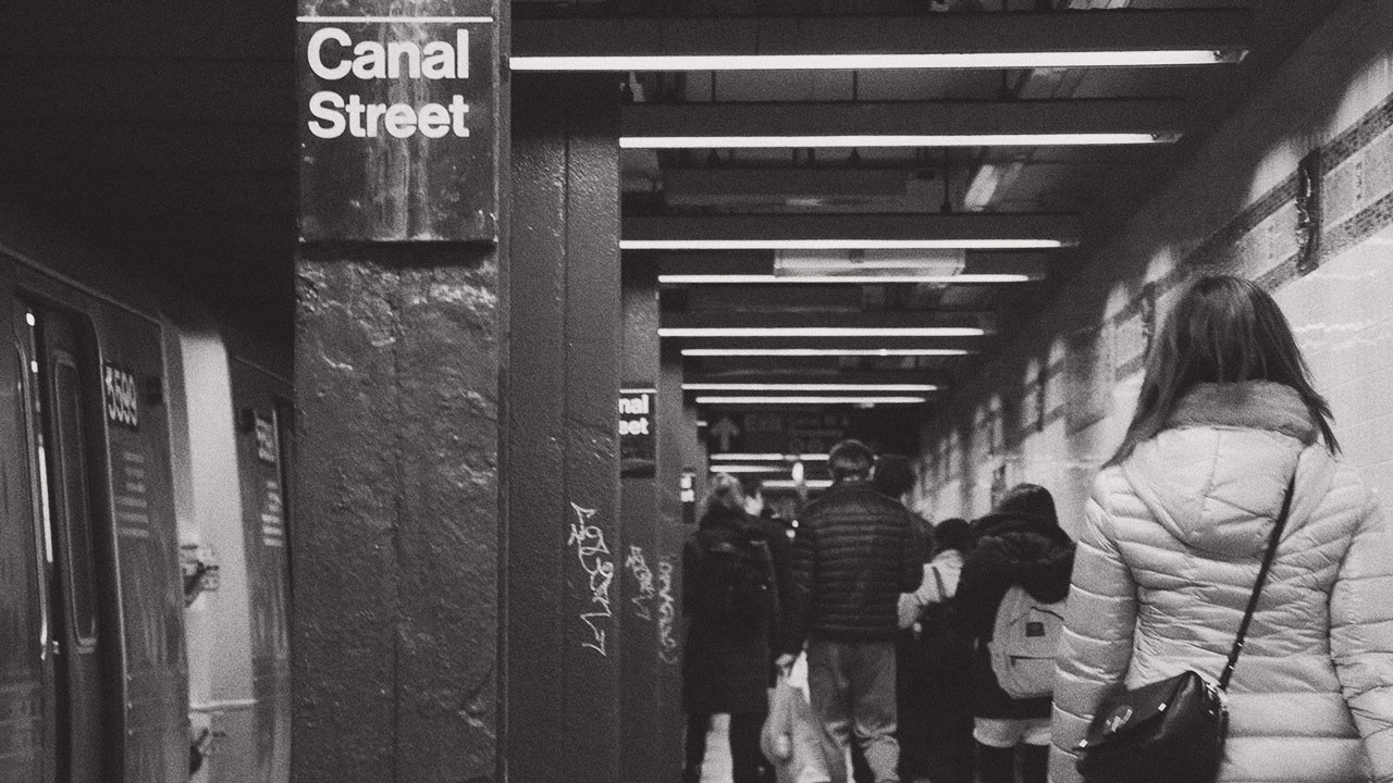
Deutsch New York (D.NY) was born in New York, grew up in New York, and is firmly rooted in its New York identity. We wanted to emphasize those roots without resorting to something predictable or overly trend-driven. With that in mind, we landed on the thesis of the identity: the visual experience of New York at street-level.
The chaos of signage from local shops to national brands to graffiti and advertising — all being lorded over by skyscrapers and defined by the strict efficiency and consistency of the city's grid — creates a visual palette unlike anywhere in the world.
We loved the primary mark, but we also pushed and experimented with narrowing the number of different typefaces we used and how they were applied within the bounds of our established idea. Ultimately, we landed on the idea of primary, secondary, and diminutive marks. All of which have a role to play in the brand system.
The diminutive mark became our primary mark for motion graphic applications like sizzle reels, ends of case studies, office signage, and other moments where high-impact animations were appropriate. When it came to defining the mograph language, we thought about the constantly changing colors and intensities of Times Square's signage.
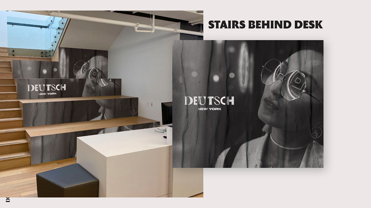
The thesis of our identity — New York at street-level — drove our photography decisions. New York is as much about people as it is about buildings, so the identity makes substantial use of photos of actual New Yorkers all around the city. A consistent color grade (available as a Photoshop action to brand designers) helps to further unify the photographic suite.


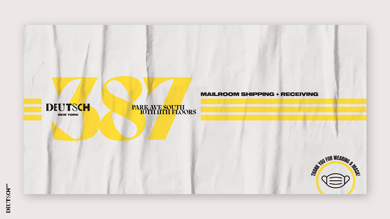
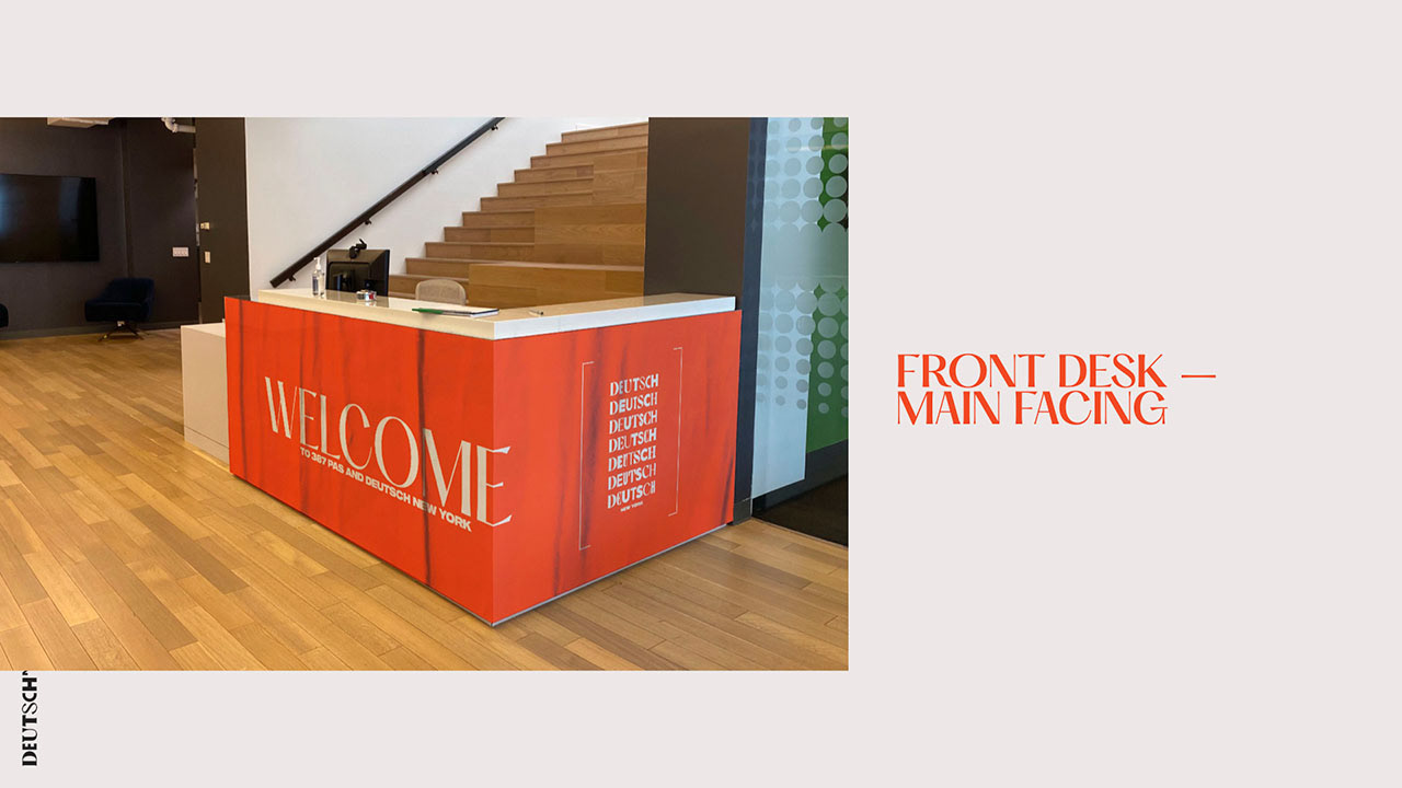
In major display instances — both physical and digital — we applied textures to mimic the effect of wheat posters found all over the city. One such use case was the in-office branding package. The in-office branding ultimately totaled 16 different custom layouts and 4 master "template" layouts that could be customized as needed.


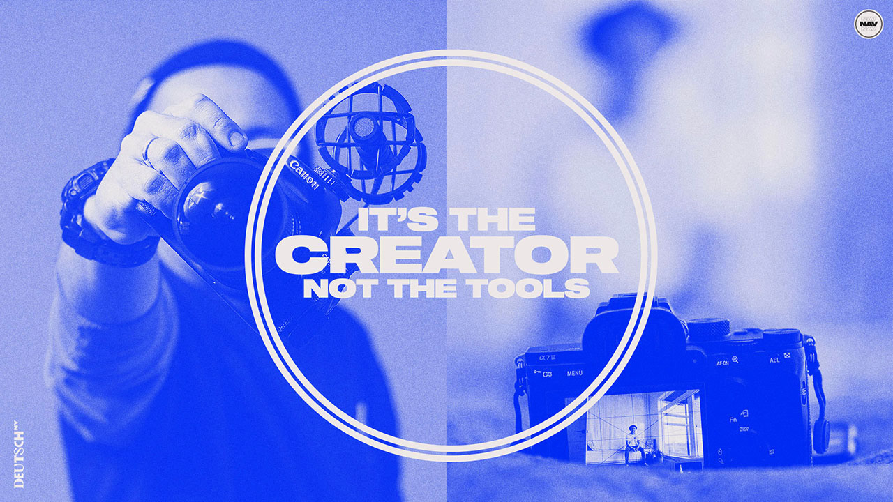
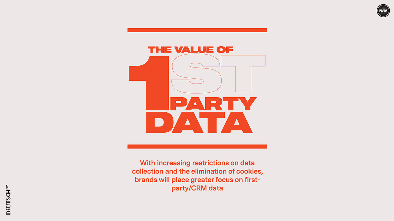
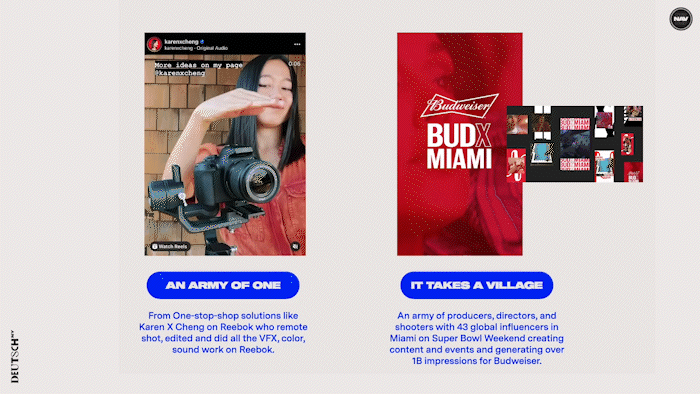
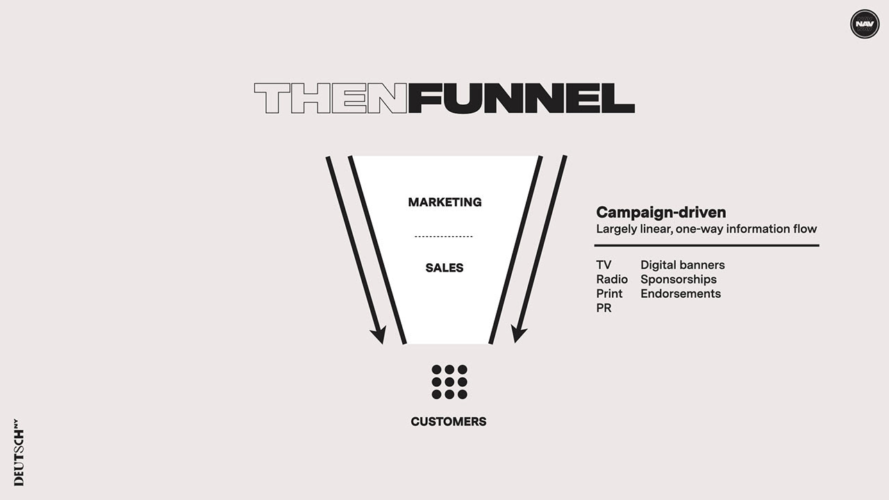
And then there's decks. Decks on decks on decks. Helps to have a easy-to-use template that you can build on top, like in this example.


For more examples of work using the Deutsch NY identity, please check out the Presentation Template page.
Roles + Responsibilities: design director.